Commercial: Liverpool brand stories 3
Branded temples
As we've been indoctrinated to believe that most competition in most circumstances is a good thing, it's perhaps unsurprising to find cathedrals rubbing hard up against each other.
What's striking however, in Liverpool's case, is the contrasting qualities that the brands of the two institutions concerned, the Liverpool Cathedral and the Metropolitan Cathedral of Christ the King, display.
Start at the southerly end of Hope Street with the Anglican lot. They have a good story to tell. The UK's biggest Anglican cathedral, over 100 years in the building and only finished as late as 1978. And it's brand (and yes, there very definitely is one) is very well managed.
The logo itself is subtle and elegant, and communications materials - visitor guides and the like - are well-designed. Experientially (I mean in a non-transcendent sense), the cathedral delivers - staff are warm and chatty.
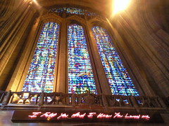
Best of all, it's pulled off the difficult trick of being both comforting and wee bit dangerous, in the main by having on prominent display a work by Tracy Emin. The work itself (above) is glorious, and achieves that magic alchemy of becoming better in juxtaposition with the stained glass window - and also making the window better to behold too.
It all helps to contribute to the feeling that Liverpool Cathedral has thought deeply about its brand, and is working well to bring it to life.
Once you've come down from the tower, and made your way up Hope Street, past the Phil and the Everyman, you arrive at the edifice that is the Metropolitan Cathedral. Here things are a little bit more... forbidding.
Location plays its part, at once in the shadow of its bigger cousin, and yet also thumbing its nose up at it. As you stand beside the flying butresses (or 'boomerangs', as one of the Pevsner guidebooks calls them) you feel you could be in Brasillia.
The dominant crown on the top of the building is at the heart of this brand. And this feels like it's focusing on the wrong thing - that's to say, it puts front and centre an image which is imposing, domineering and possibly even a bit devilish.
And yet, at some level 'drama' in the most biblical sense is present here; especially when you go inside, smell the incense, bathe in the blue light, whisper past the various chapels or watch nearly 70 people turn up in their Saturday evening finest (including Saturday night flesh) for a christening.
Which suggests the main difference between these two brands. For the Anglican cathedral, the brand is open and warm, designed to radiate out and attract. For the Metropolitan cathedral, it's darker, deeper, a bit more mysterious. And as a result, a bit more stirring. Less attractive to outsiders, perhaps. But if you engage, you get a more rewarding experience (probably in a transcendent sense too).
Labels: commercial liverpool brand stories anglican catholic cathedral


0 Comments:
Post a Comment
Subscribe to Post Comments [Atom]
<< Home