Commercial: Flickr Clock
I've not seen much mention of this, but after the hoohah a while back about Flickr hosting videos, it turns out their doing something lovely with them.
It's called the Flickr Clock, and it's certainly the first time that I've seen content attempt to be organised by time as opposed to some other heuristic. As the note in the group says:
Flickr Clock is an ongoing project that will collect member video and display it according to the (approximate) time that it was taken....
Help us build a clock that celebrates the Flickrverse -- in how, despite our borders or geography, we're very much the same and uniquely different.
Please feel free to share video that you feel captures a "real" moment in time where you are. Think long photo.
BTW, isn't that 'long photo' lovely?
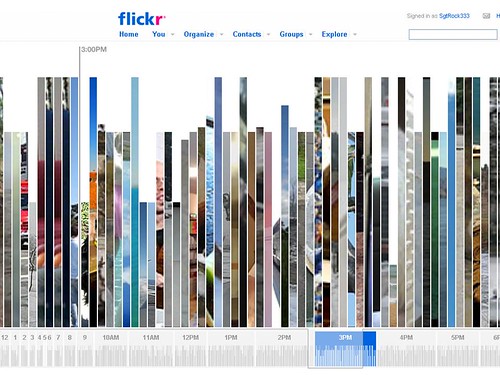
This is what you see when you first get to the clock:

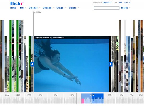
And when you choose something to watch:

It's not perfect: I find the three overlapping layers of colour on the bar chart at the bottom a bit disorientating, and I think there needs to be a bit of an explanation when you land on the page. But it's certainly a charming way of organising charming stuff.


0 Comments:
Post a Comment
Subscribe to Post Comments [Atom]
<< Home